Displaying Your Shot Glass Collection
You might have shot glasses from all over the world, but having your collection on display isn’t really cool, as it can come across as tacky. You’re better off storing them in a cabinet and bringing them out when you want to use them.
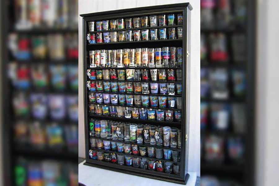
Displaying Your Shot Glass Collection
Walls Painted In Bold Colors
There’s nothing wrong with incorporating bright and bold colors to any part of your house, just not on your walls. There are many other ways to bring color to your living room. Using throw pillows is a great and simple way to do just that.
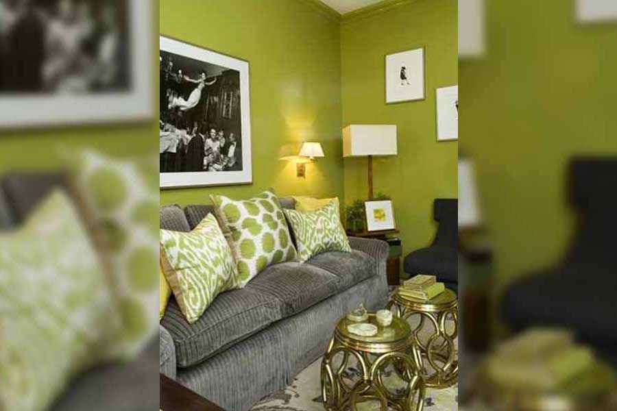
Walls Painted In Bold Colors
Using Tiny Rugs
The purpose of a rug is to pull a room together and floating rugs that aren’t anchored to anything defeat that purpose. It’s almost like wearing a t-shirt that’s too small. Your furniture should always have two legs on a rug.
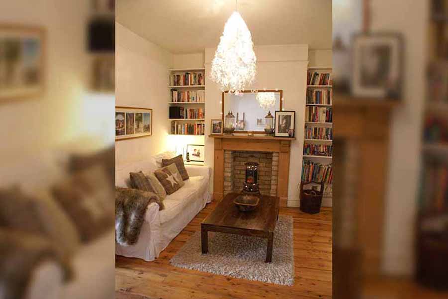
Using Tiny Rugs
Furniture That’s Not Permanent
Using recycled materials to create a unique unit for your living room is great, as long as it’s a fixed, permanent unit. If you’re going to use a couple of crates to create a temporary cabinet, then that won’t work.
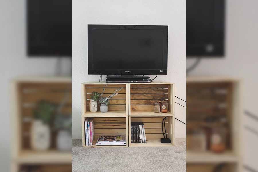
Furniture That’s Not Permanent
Strangely Shaped Lamps
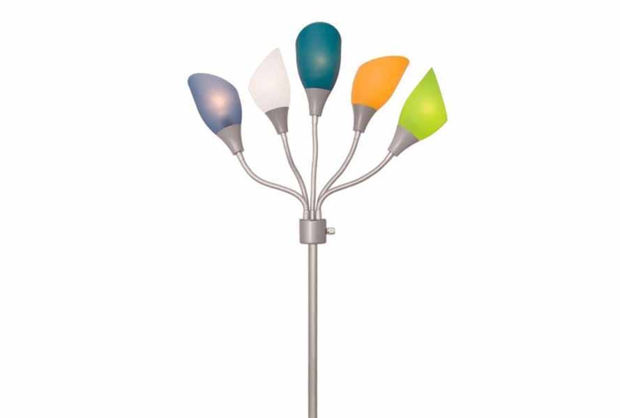
If your lamp has multiple arms and multi-colored lamp-shades then there’s a problem. A simple, one-lampshade lamp is always more elegant and appropriate for a living room. You can still have an artistic lamp but a rainbow-colored octopus lamp is a no-go.
Strangely Shaped Lamps
Futon Sofas
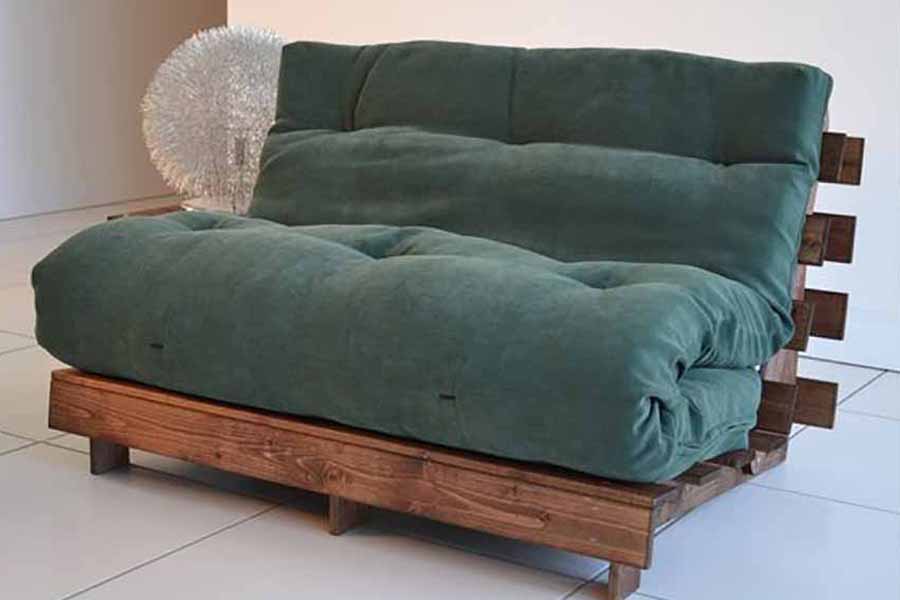
If you want your guests to feel like they’re stuck in the 90s, or if you’re still in college and live with other students, then a futon sofa is a great idea. If not, then an actual sofa is the only way to go.
Futon Sofas
Plastic Plants
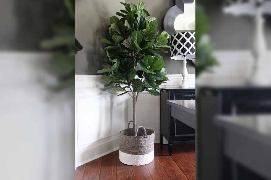
A fake plant is even worse than having no plants. A plastic plant gives the impression of lifelessness and you don’t want that in your home. If you’re not with plants, then you could opt for some cacti to bring color into the room.
Plastic Plants
Cliché Art Pieces
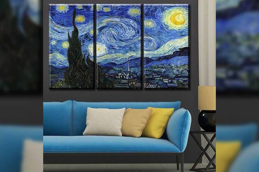
If you want to display some art on your walls then avoid cliché paintings. Instead of getting a copy of something like Van Gosh’s “Starry Nights” that everyone has, try to get something unique that will suit the theme of your living room.
Cliché Art Pieces
Exposed Cables
We all know that you need cables to connect your entertainment systems and televisions sets, but no one wants to see your cluttered cables. If you don’t have any gadgets to keep your cables neat, at least store them out of sight.

Exposed Cables
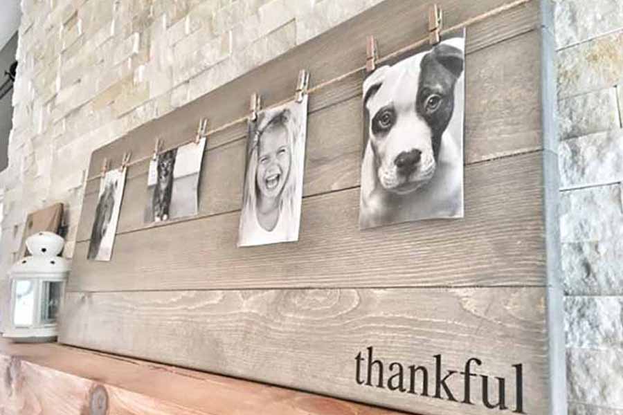
Tacky Photo Frames
Photo frames that tell you how to feel are not ideal. There are so many different types of frames on the market. Shop around and you’re sure to find something that’ll be perfect for your living space that doesn’t have any emotions on it.
Tacky Photo Frames
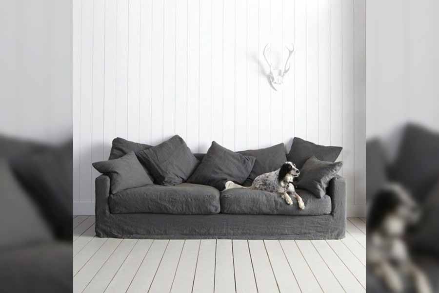
Same Colored Pillows
Throw pillows are not only there for comfort but to add a splash of color. If your cushions are the same color as your sofa then maybe it’s time to get creative. First, pick a color scheme and then get some new cushions.
Same Colored Pillows
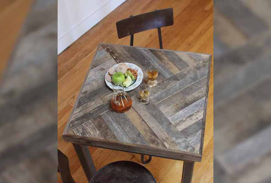
Coffee Table Made From Recycled Pallets
DIY pallet furniture has become quite popular in the past couple of years but that doesn’t mean that a pallet coffee table will work. Unless you want your living area to look like a lumber yard, stay away from pallet coffee tables.
Coffee Table Made From Recycled Pallets
Plastic Drawers
Plastic storage is never an option for storing junk you may have lying around. Instead, you could use wicker baskets or even decorative fabric boxes. Plastic containers belong in your garage or in the attic. Basically anywhere out of sight.

Plastic Drawers
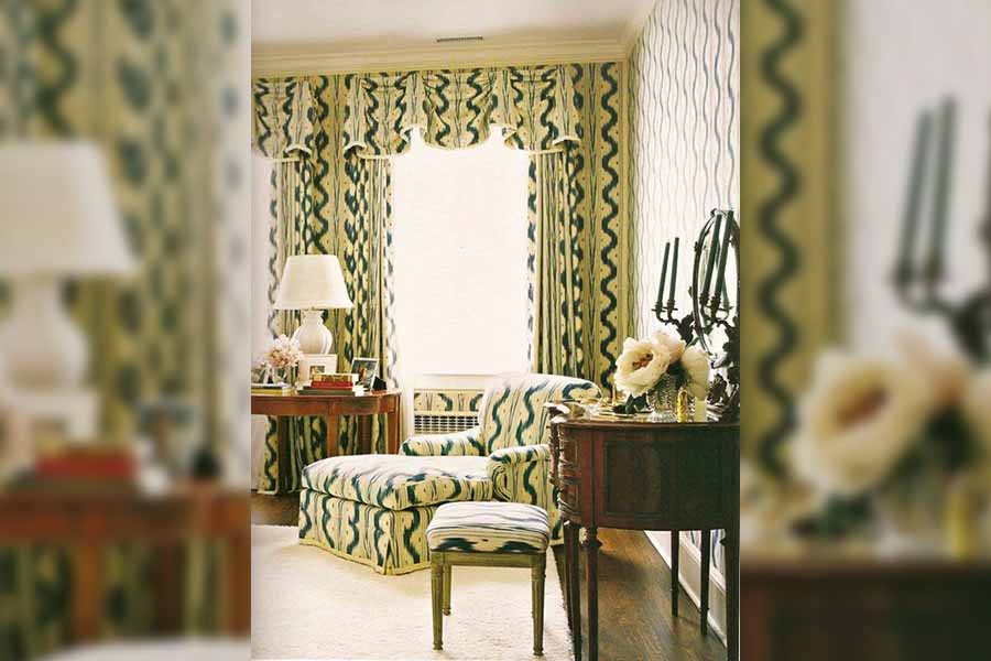
Curtains That Match The Sofa
If your sofa and your curtains are made from the same fabric then you need to reconsider your options. Instead of using the exact same fabric get curtains that will complement the sofa and create a sense of harmony in the room.
Curtains That Match The Sofa
Taxidermy Of Any Kind
If you still have a Big Mouth Billy Bass hanging on your living room wall there’s a problem. This classic piece may have been a part of American pop culture years ago, but these are different times that call for better decor.

Taxidermy Of Any Kind
Photos Displayed Without Frames
Many people like to get creative when it comes to how they display their family photos. Unfortunately, photos that are displayed as-is without frames comes across as immature. A simple frame will make all the difference in transforming your living room.

Photos Displayed Without Frames
Plastic Covered Sofa
Everyone knows that kids can make a mess and possibly stain the sofa, but that’s no reason to have your sofa covered in plastic. Furniture covered in plastic makes a room feel like a crime scene instead of a cozy living room.

Plastic Covered Sofa
Windows Without Curtains
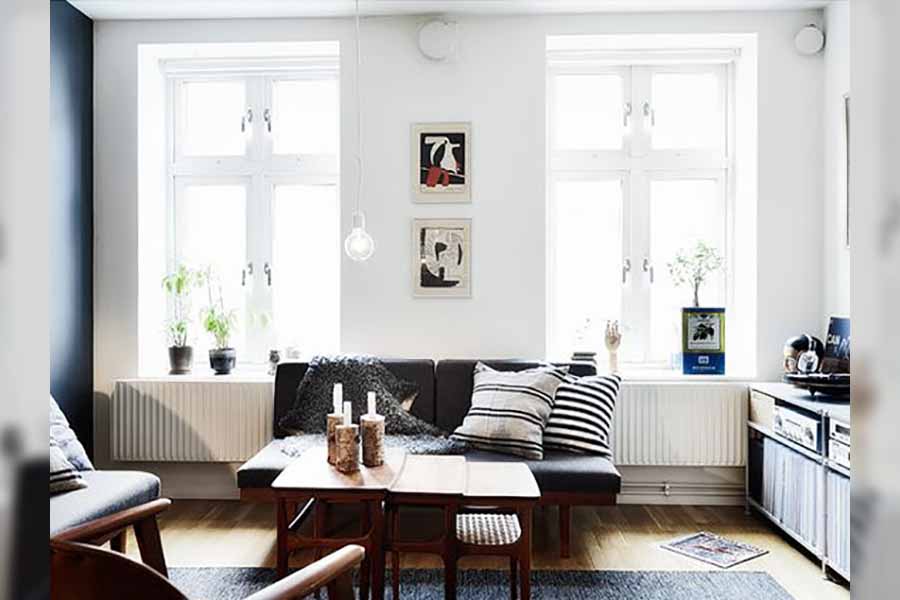
It may seem like a good idea to have no curtains to let natural light in, but it isn’t. If you don’t like curtains, blinds are a good alternative. That way you could keep your privacy as well as let the light in.
Windows Without Curtains
Barn Doors Inside The House
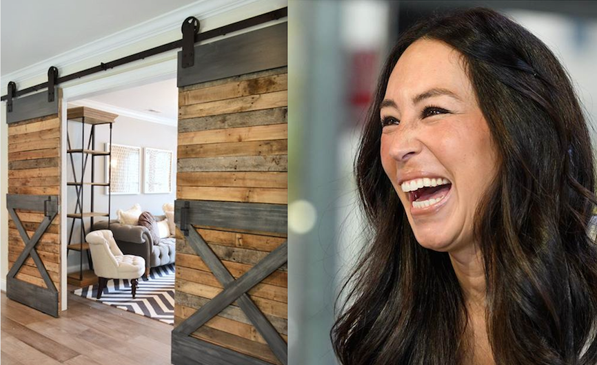
Thanks to Pinterest, barn doors actually became quite a hit recently. It’s not really clear why though, as they’re not exactly the best option for a living room. Unless you live on a farm, barn doors are just not appropriate. Joanna Gaines would totally agree with us that these look ridiculous!
Barn Doors
Too Many Pillows Everywhere
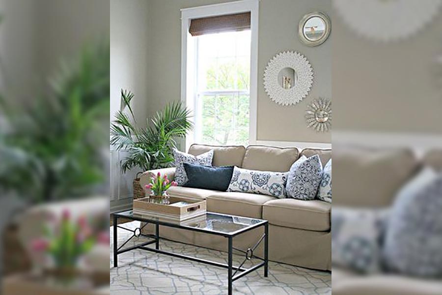
Throw pillows can add color and give a certain feel to a room, but when you have too many it throws everything off balance. Pillows are there to enhance the theme of the room and not to drown the sofa with clutter.
Too Many Pillows Everywhere
Shaggy Carpets
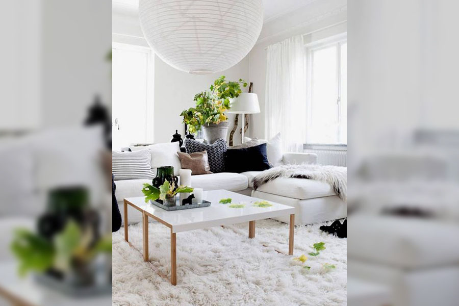
Shag carpets were very much the craze in the 70s, but no so much today. If you love the look and feel of something soft or shaggy, then you could opt for a shaggy throw pillow instead. Otherwise, stay away from anything shaggy.
Shaggy Carpets
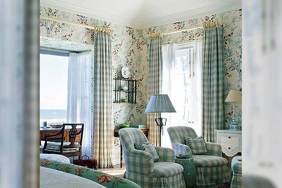
Chintz Wallpaper
If you want your living room to look like a bed and breakfast in New England then Chintz wallpaper will fit in perfectly. Try to stay away from any decor that is too busy as it will create an ambiance of clutter.
Chintz Wallpaper
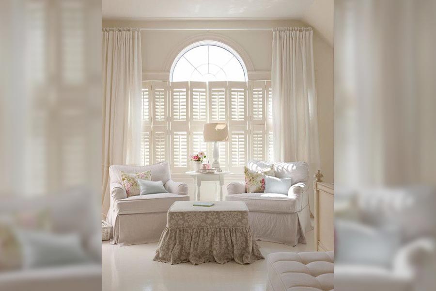
Ruffled Skirts On Your Furniture
If any piece of furniture has ruffled skirts your living room will look uptight, stiff, and out of date. Instead of having ruffles skirts, replace those with straight skirts. That will loosen up the room and be more balanced.
Ruffled Skirts On Your Furniture
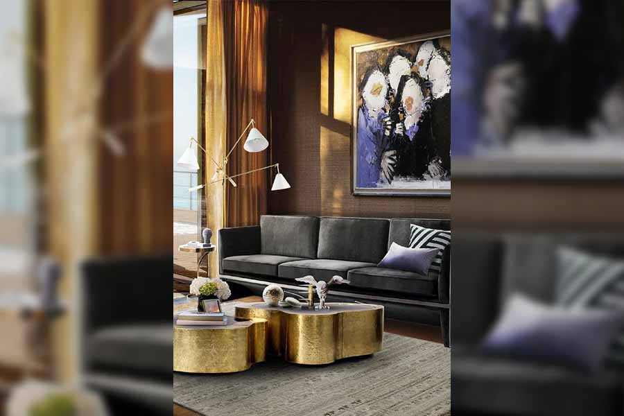
Golden Fixtures
In the 80s, gold fixtures were all the craze and you’d find them in every household. Times have changed though and they’re not so cool anymore. If you’ve had those fixtures for 30 years, it’s time to get new ones.
Golden Fixtures
Decorative Wooden Duck Ornaments
Unless you’re a duck farmer or enthusiast, then don’t have wooden mallards in your living room. They’re tacky and definitely not cool. There are so many different other ornaments to add personality to the room. Find something that will match the theme of your living room.

Decorative Wooden Duck Ornaments
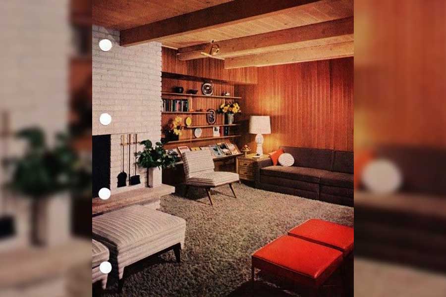
Wooden Panels
Wooden paneling was awful even in the 80s when they were more common, now it’s even worse. If you really love wood that much maybe a log cabin would be better suited to your taste. Otherwise, lose those wooden panels.
Wooden Panels
Mismatched Shapes And Patterns
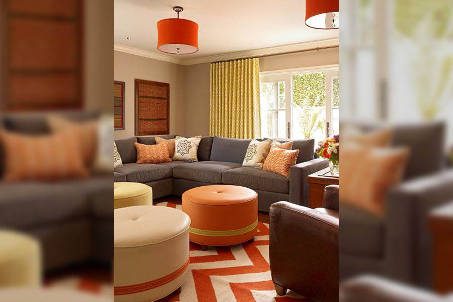
A living room should be a place where you can relax and unwind. If it’s too busy and has mixed colors and lines that clash, it throws everything off balance. The expression ‘less is more’ couldn’t be truer.
Mismatched Shapes And Patterns
Wooden Blanket Ladders
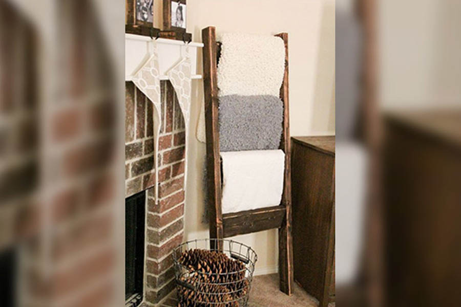
You might think that by having a wooden blanket ladder you’re adding a rustic look to your living room, but it just looks tacky and out of place. There are more tasteful rustic items you could bring in to create that look.
Wooden Blanket Ladders
Mounted Taxidermy Or Animal Skulls
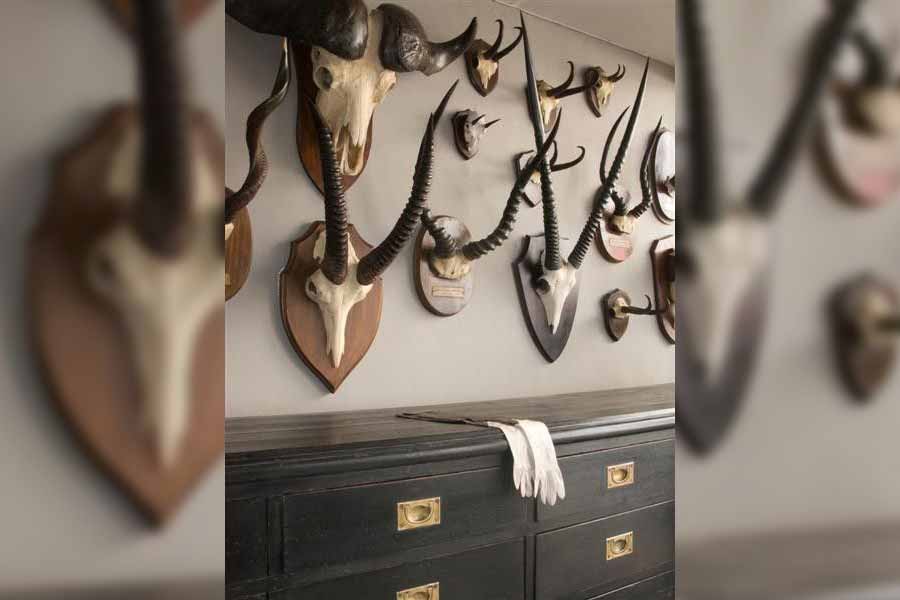
This trend is a relic of antiquated decor styles. Now it seems a bit tasteless to display mounted animals skulls in your living room. Who else is reminded of the pub scene with Gaston in Beauty and the Beast?
Mounted Taxidermy Or Animal Skulls
Lampshades from Another Era
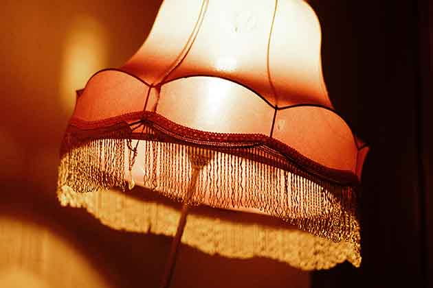
There’s nothing worse than a tacky lampshade that’s over 40 years old in your living room. You don’t need to replace the lamp itself, just get a new lampshade. One that will compliment your living space that will create warmth and comfort.
Lampshades From Another Era
Live Laugh Love Decor
Signs that say “Live, Laugh, Love” are cliche and are an absolute no-no for your living room. It started off as a small quirky modern decor idea but is no longer a hit. Opt for a nice painting or a photo frame instead.

Live Laugh Love Decor
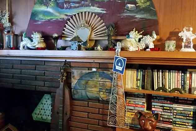
Knick-Knacks Everywhere
If you like collecting knick-knacks from places you’ve visited that’s great, just don’t display them all in your living room. Your living room will just look untidy, busy, and cluttered. And let’s not mention how much dust they can collect.
Knick Knacks Everywhere
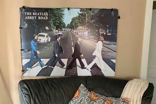
Frameless Band Posters
If you’re a teenager living with your parents, then hang as many frameless band posters in your room as you like. But if you’re not, then never do that in your living room. If you have a rare poster, then frame it then hang it.
Frameless Band Posters
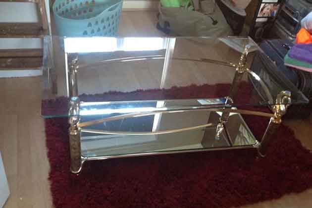
Tacky Glass Tables
Glass tables were tacky decades ago already, so why would they be any better today? Other than being a safety risk, glass furniture is just not a good choice. Any other material coffee table will be a better choice.
Tacky Glass Tables
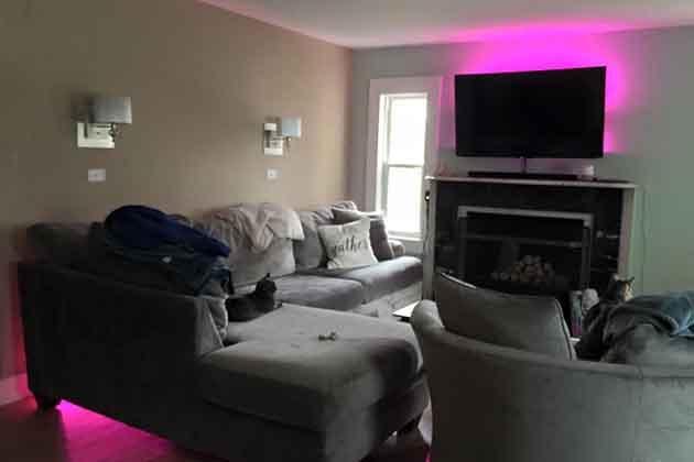
Lights That Change Color
Color-changing lighting does not work anywhere else except in a nightclub. You should even stay away from mood lighting. Instead, get lamps with soft lighting if you want to play around with your lights.
Lights That Change Color
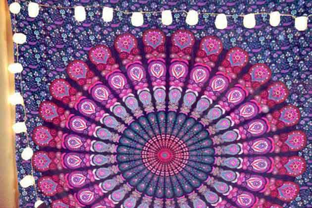
Busy Tapestries
Keep your busy tapestries in your bedroom, where no one else can see them. If you had a mandala tapestry when you were 20, then display in any other room. The boho-chic look is outdated and tacky.
Busy Tapestries
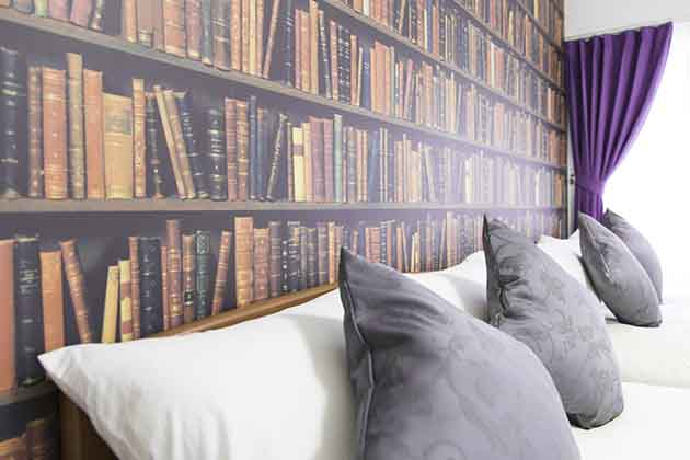
Wallpaper With The Image Of A Bookcase
If you’re truly a bookworm, then surely you’d want to display your books in a proper case or shelf instead of getting a bookcase wallpaper. This just makes it look like you’re a wannabe reader that wants the room to have an intellectual look.
Wallpaper With The Image Of A Bookcase
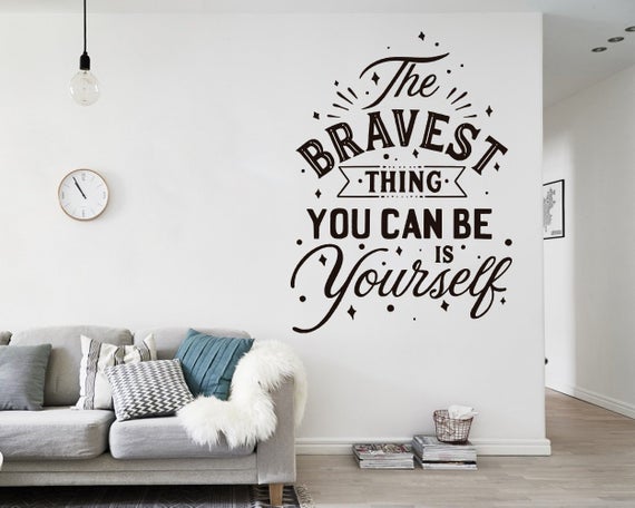
Wall Decals With Quotes
There’s nothing wrong with wall decals, but one with words that spell out quotes have been overused. It’s even worse if the decals printed on the walls tell you what you should do in that room, like “Play,” “Read”.
Wall Decals With Quotes
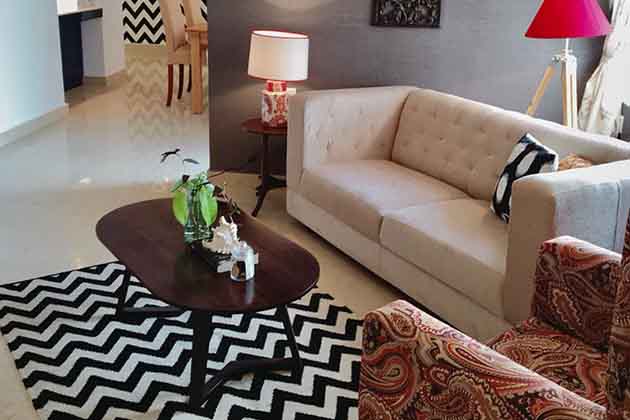
Chevron Patterns
Instead of using such a busy pattern, opt for a simple one that will bring harmony to your living room. Your guests won’t want to feel like they’re being hypnotized when they walk into your living room. You want them to feel comfortable and welcome.
Chevron Patterns
Plain White Living Room
When people walk into colorless rooms they immediately associate it with a sterile hospital room. If you like the minimalist look then you can still achieve this without going to the extreme. A touch of color always does wonders to a living space.
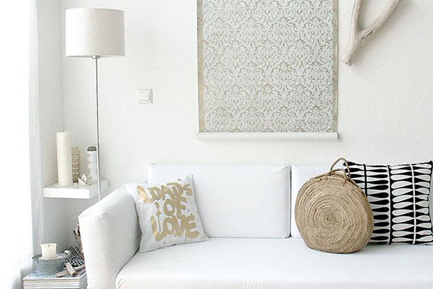
Plain White Living Room
Choosing The Wrong Sofa
All designers will agree that the key to a great living room is the sofa. A sofa is one piece of furniture that can determine the look and feel of the room. A sofa that’s too big or too small is not good.
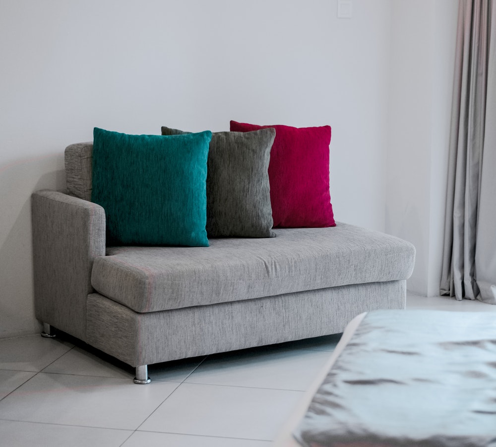
Choosing The Wrong Sofa
The Showroom Feel
Your living room should feel like people live there and enjoy the space. You don’t want to fall into the trap of making it look like it belongs in a furniture store’s showroom. If you buy everything from the same store you’ll get that feel.
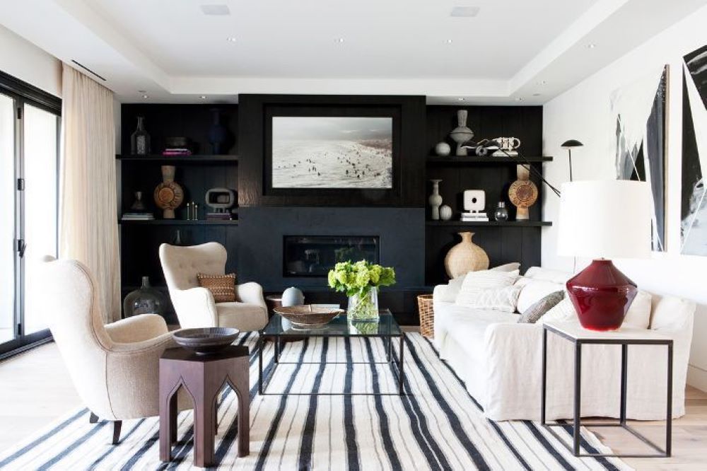
The Showroom Feel
Poorly Planned Out Layout
It’s easy to just put a sofa against the wall facing the television, but that isn’t always the best layout. The living room is a place to relax and chat with friends and family so you need to think about conversation groupings.
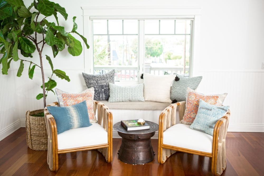
Poorly Planned Out Layout
Art That Hangs Incorrectly
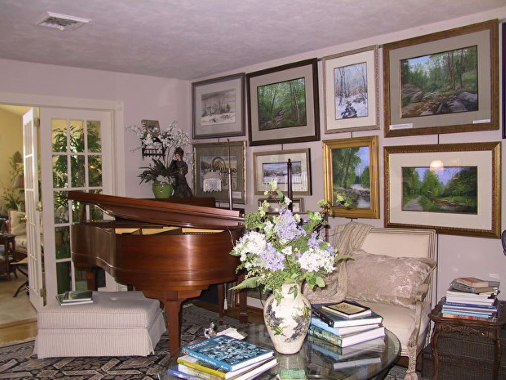
When you have art hanging incorrectly in your living room, it’s very hard to miss. If you have too many paintings on one wall or if the sizes and pictures don’t flow, your living room will look out of balance.
Art That Hangs Incorrectly
Making Your Living Room Look Unused
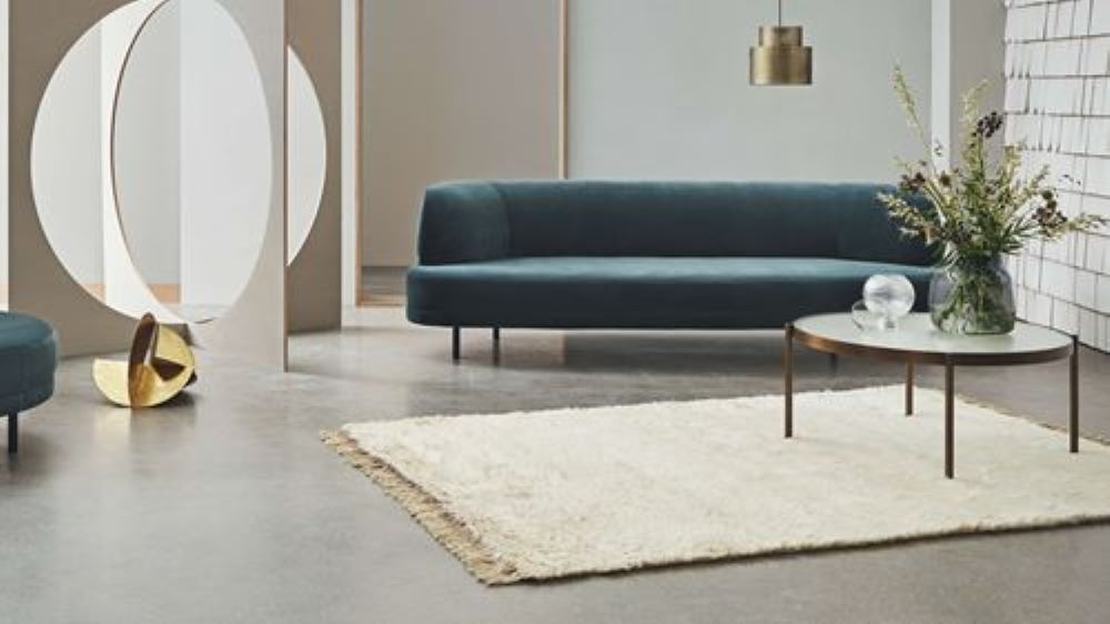
A living room should look welcoming and cozy. It’s a place that sets the tone for your home. It should look too perfect that people don’t feel comfortable. Don’t choose fabrics that are too rigid and inconvenient. Make it look livable.
Making Your Living Room Look Unused
Matching The Architecture Of The House
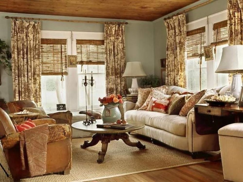
The furniture in your living room doesn’t necessarily match the architecture of your house. Most people think that because their house is from a certain period, the decor should be the same. That just makes it look old fashioned and outdated.
Matching The Architecture Of The House
Not Measuring Before Buying
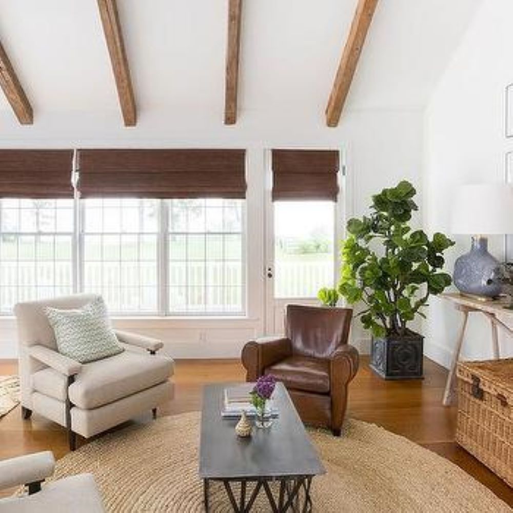
A lot of people make the mistake of not measuring the room and the furniture when choosing sofas and chairs for the living room. If you’re going to be mixing periods and styles you need to see that the sizes all correspond.
Not Measuring Before Buying
Picking The Wrong Fabrics
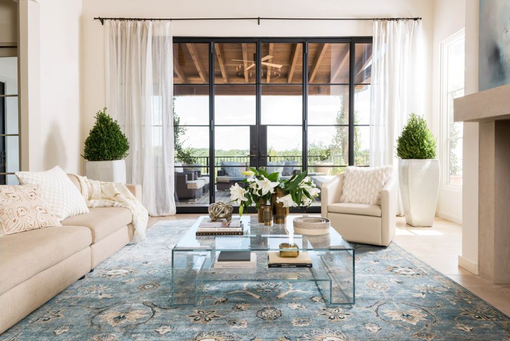
When you’re buying a rug, make sure that the fabric is hard-wearing. Stay away from silk rugs as they don’t last and will look tattered and messy in no time unless you’re going for a museum look in your living room.
Picking The Wrong Fabrics
Ornate Sofas
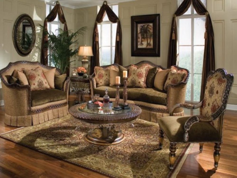
Sofas that are overly ornate have to go. Your living room shouldn’t look like it belongs in the 40s. If you like the vintage look there are other subtle ways to incorporate that. Your sofa is the focal point so keep it simple.
Ornate Sofas
Coffee Table That’s Disproportionate
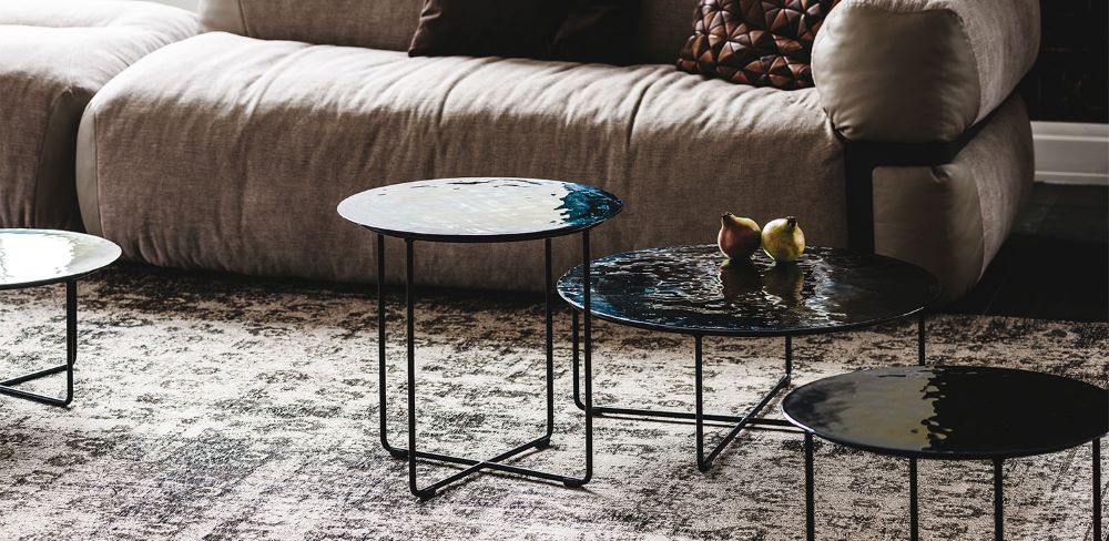
The sofa is the central point, but your coffee table is the second most important piece of furniture in your living room– so you should choose one carefully. It can’t be too big or small or oddly shaped in comparison with the sofa and the room.
Coffee Table That’s Disproportionate
Cheap Art On Your Walls
Cheap art can really drag down the look of your living room. There are other affordable ways to get an art piece these days. One big painting is better than lots of small ones. You could even opt for a mirror instead.

Cheap Art On Your Walls
Curtains That Hang Poorly
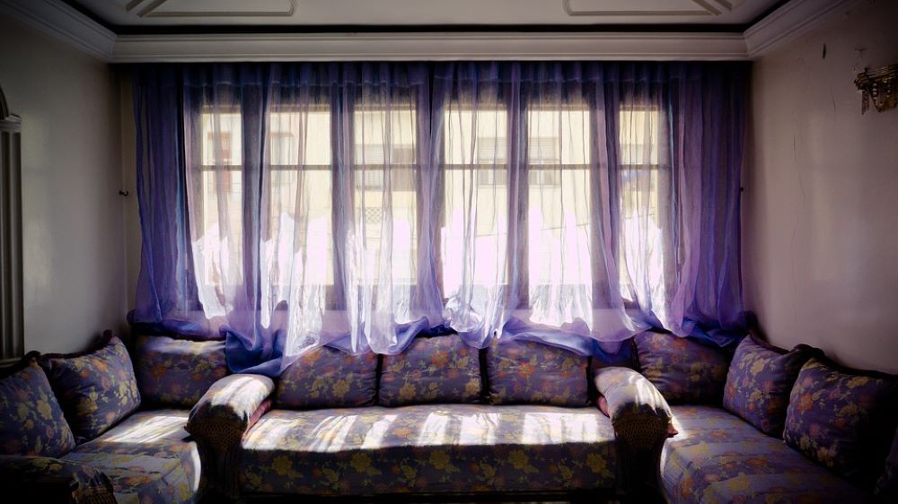
Other than making sure your curtains aren’t too busy and match the room, you need to make sure that they hang properly. If your curtains hang poorly, your living room will look tacky and unkempt.
Curtains That Hang Poorly
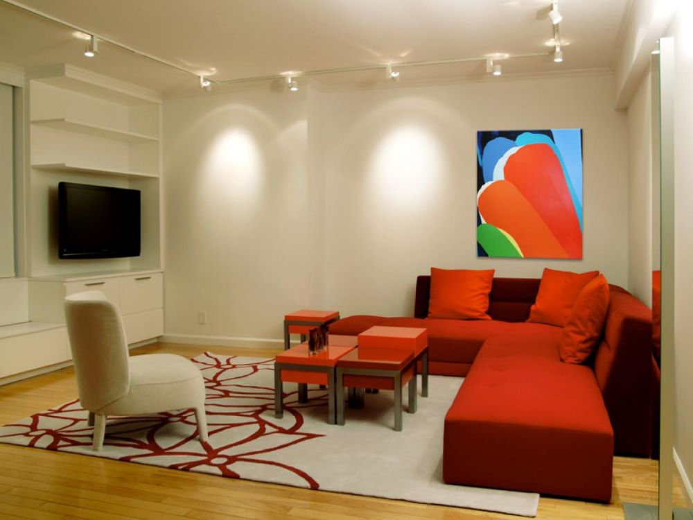
Lighting That’s Too Harsh
Your living room should have warm lighting which gives it that comforting feel. You can’t put a fluorescent light in there. It’s a good idea to update your light fixtures if you want to improve the feel of the room.
Lighting That’s Too Harsh
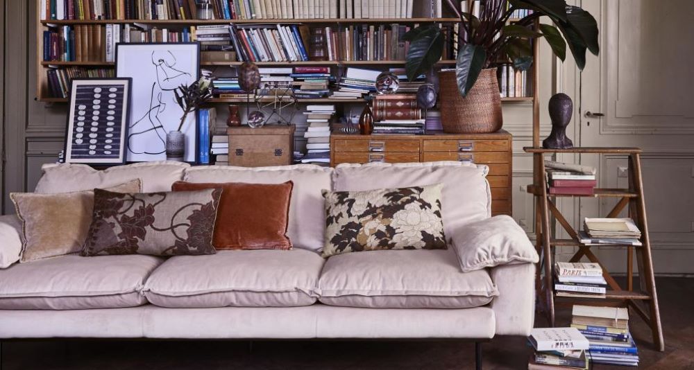
Too Many Accessories
No matter how expensive your ornaments and accessories are, if you have too many scattered around your living room it will look cluttered and untidy. Instead, group your ornaments together and it will be more balanced and the room will look cleaner.
Too Many Accessories
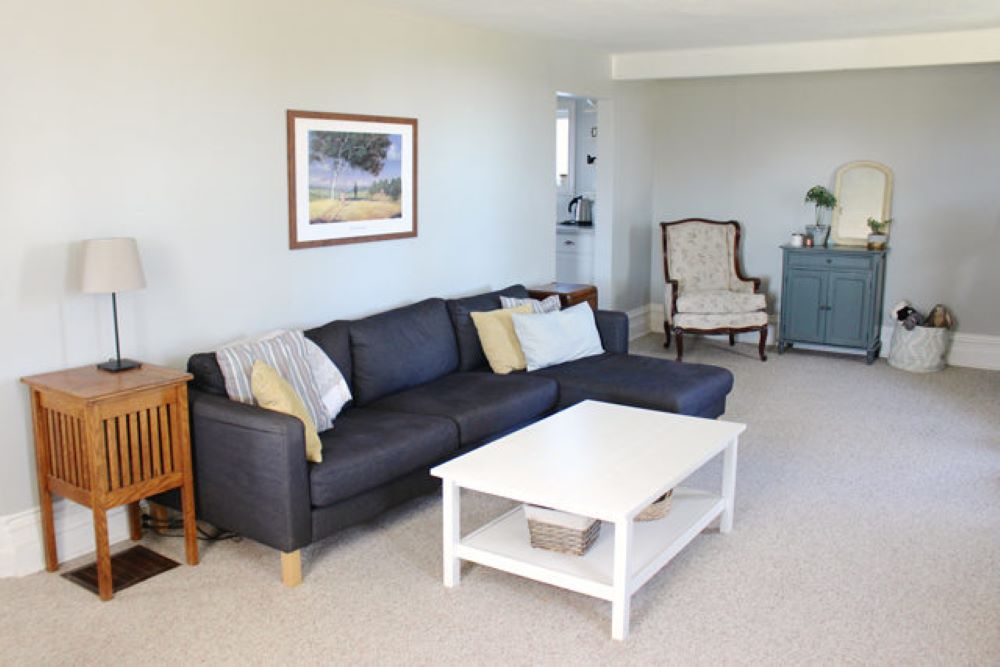
Furniture Up Against The Wall
A common mistake people make is to line their walls with furniture. You can float your accent chairs or even your sofa closer to the center of the room. That will balance out the layout and give it a different dimension.
Furniture Up Against The Wall
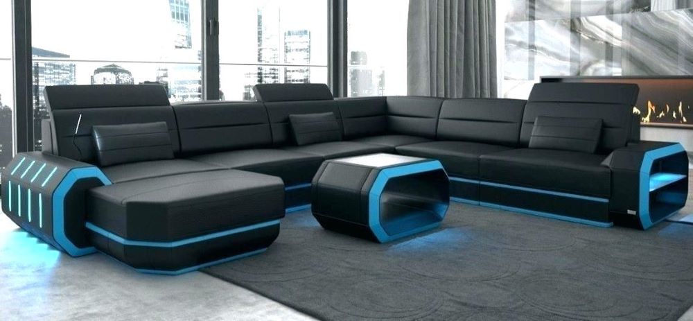
The Uncomfortable Sofa
A lot of people make the mistake of buying a sofa that looks good. But they fail to check how it feels to sit on it. If you buy a sofa because you like the look, you might end up with something that’s completely uncomfortable.
The Uncomfortable Sofa
A Television Shrine
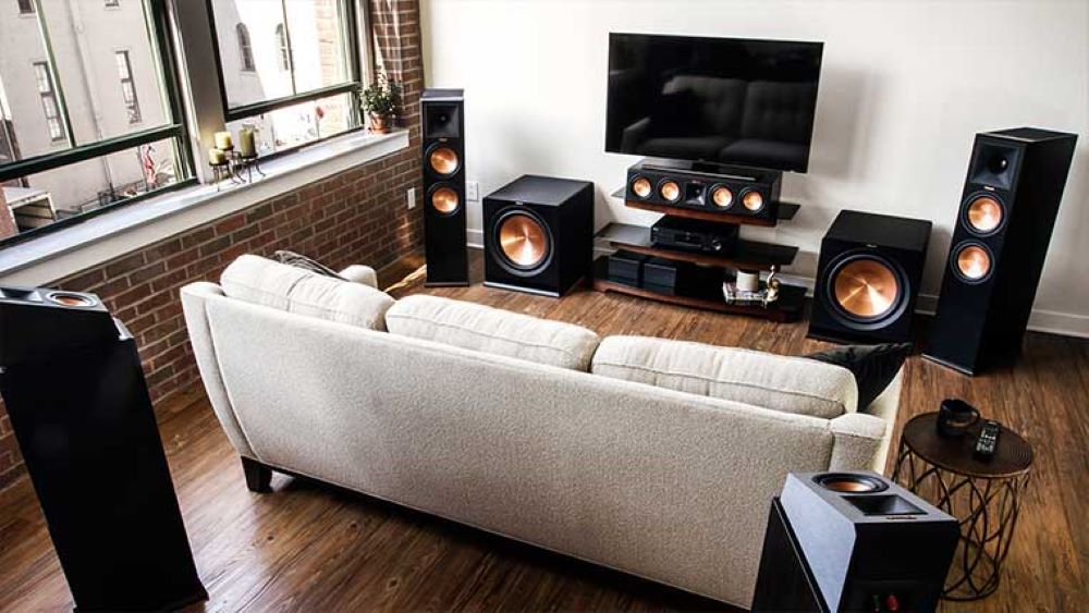
The TV is a very important fixture in many families, and it usually sits in the living room. It’s ok if your TV is there, but just don’t turn your living room into a theatre. The living room should only be for watching TV.
A Television Shrine
Not Considering Family Dynamics
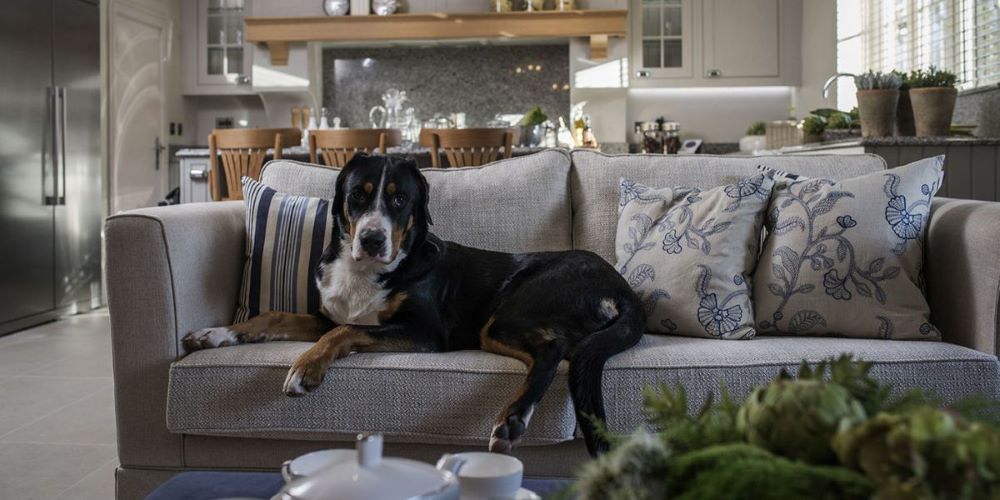
You should never buy furniture with the now in mind only. You should think about the next five years when buying furniture. Consider your family dynamics and get more family-friendly things if you’re considering having kids or getting pets.
Not Considering Family Dynamics
Replace Or Refurbish
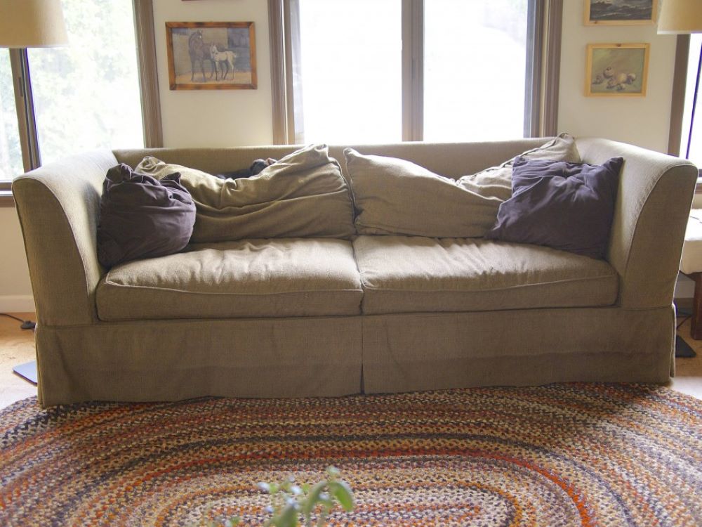
It’s only normal that after years of use, your furniture will have some wear and tear. That’s why it’s important to choose long-wearing fabrics. But when you can see that your furniture is looking tattered, it’s time to replace or refurbish.
Replace Or Refurbish
Painting Too Soon
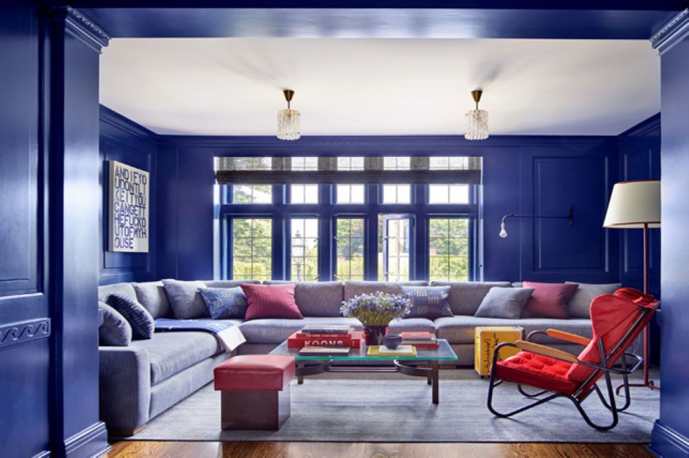
When people move into a new house they like to paint to give a fresh look. What most fail to consider is if the color they’ve chosen will match their furnishings. It’s easier to match the paint to your sofa than the other way around.
Painting Too Soon
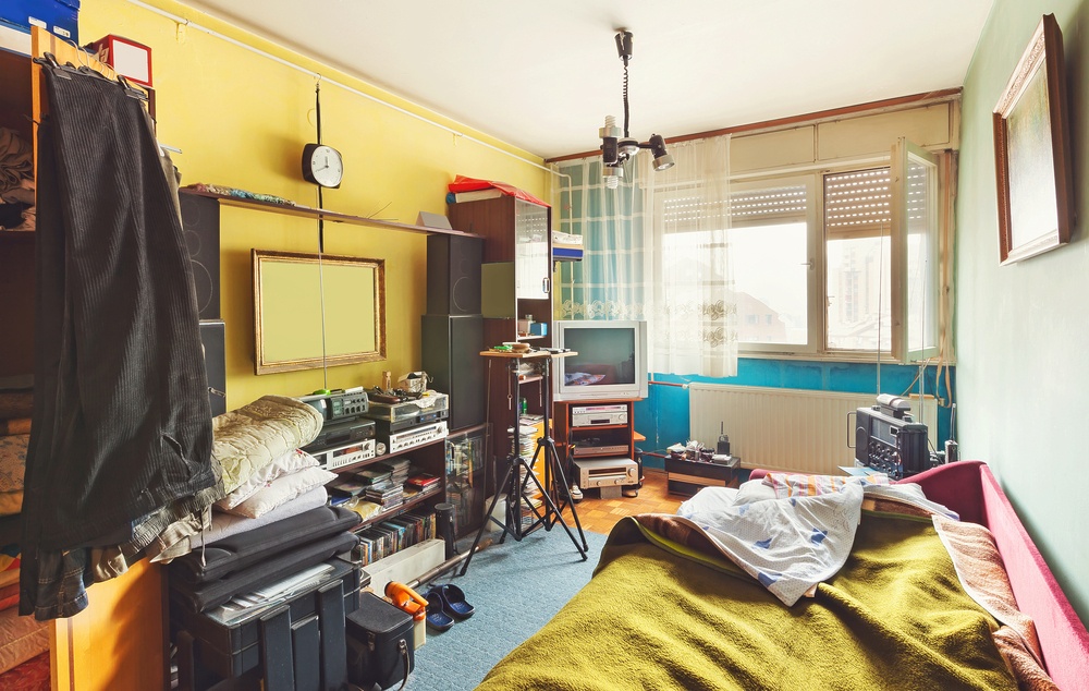
No Functionality
While you may love the newest design and furnishing trends, if they’re not suited to your home, there’s no reason to incorporate them into your home. This can lead to lack of clarity in a room’s purpose as well as unnecessary clutter, leading to an imbalanced and disorganized home.
No Functionality
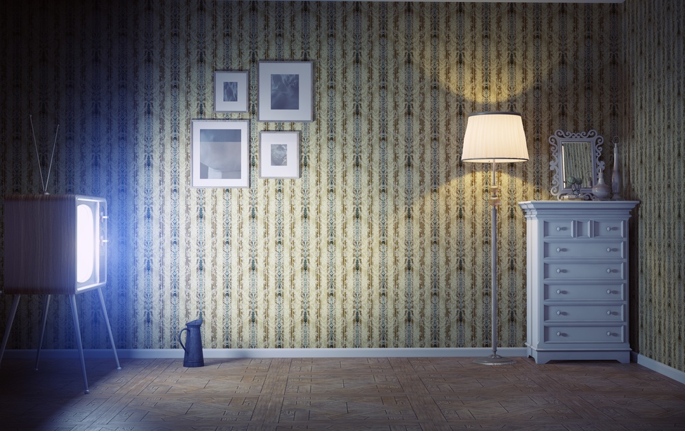
Poor Lighting
The overall feel and atmosphere of a room often depends on the room’s lighting. Having proper lighting is crucial: whether a room is too dark, too bright, or has the wrong light color, it can completely throw off the ambiance of the room. Make sure there’s also more than one source of lighting in the room..
Poor Lighting
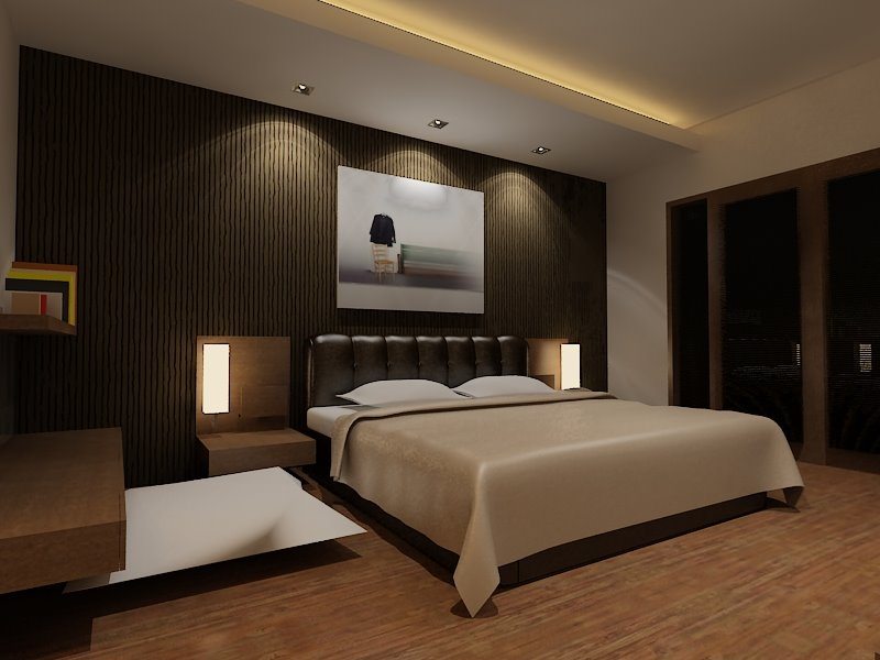
A Catalogue Room
Have you ever walked into someone’s living room only to realize that you’ve seen every single piece of furniture and decor in a store’s showroom? You should avoid having your home looking like it’s come straight out of the pages of an Ikea catalogue. Incorporate unique pieces that showcase your style and personality.
A Catalogue Room
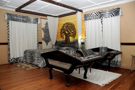
Overly Themed
While having your decor tie together with other pieces in the room, you shouldn’t go overboard with one specific theme. That’s how you end up with a living room that looks like it’s right out of the safari. Instead, focus on accent pieces.
Overly Themed
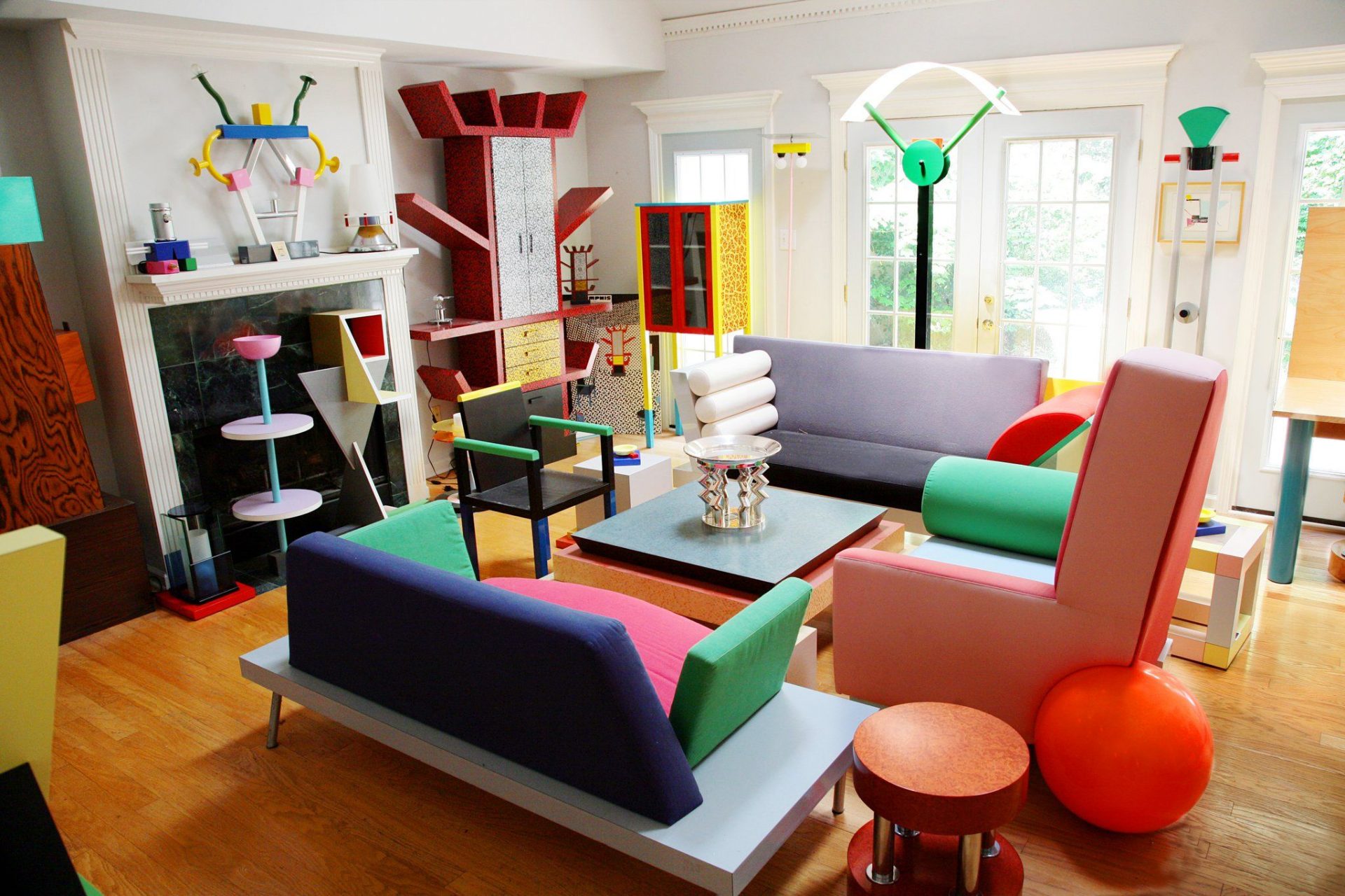
No Focal Point
If you feel like you don’t know where to look when you enter a room, it might mean that the room lacks a focal point. This can lead to feeling overwhelmed, the last thing you want to feel in your home. Choose one or two focal points in order to give your room a sense of purpose.
No Focal Point
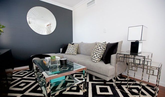
Positioning Furniture Against The Wall
This is probably one of the most common mistakes that people make, but its also the easiest one to fix! Pushing all of your furniture against the wall creates an open space in the room that can become dead space, so instead you can focus on grouping your furniture in a way that takes up the proper amount of space and also opens the room up.
Positioning Furniture Against The Wall
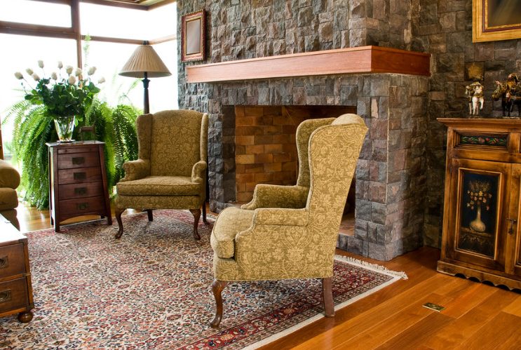
Color Clashing
While trying to make sure everything in the room matches, make sure you’re not mixing together too many colors that clash. This will completely destroy the look of the room.
Color Clashing
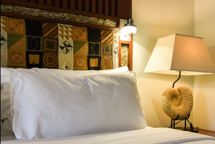
Too Much Vintage
Incorporating some vintage pieces into your room is a great way to add flair and personality. However, adding too many pieces will created a dated look that will make your room seem like it hasn’t been touched since the 70’s! Add a few key pieces instead.
Too Much Vintage
Monotone Room
While a minimalistic design is always a great choice, it’s important not to go overboard with the monochrome, as this can lead to a boring and sterile room. To avoid this, you can mix things up with different shades and textures.
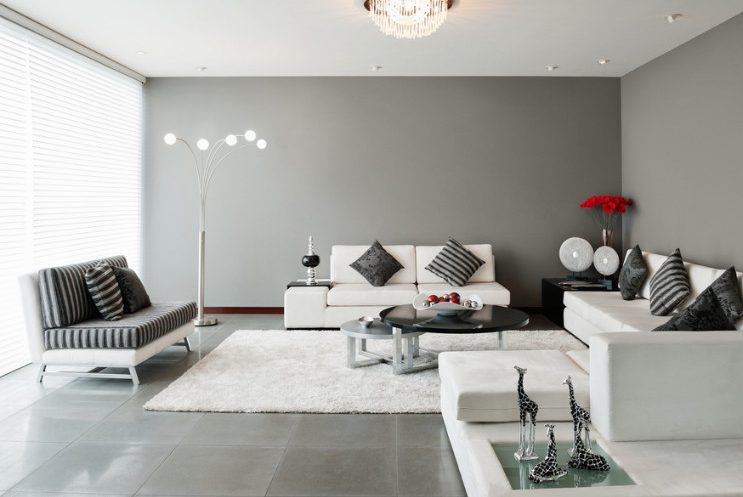
Monotone Room
Plastic Light Fixture
While these plastic light fixtures had a huge moment of popularity, perhaps they’re not the best choice for the long haul. They’re not sustainable and they’re sure to become dated sometime in the near future. They can also easily look cheap and take away from the elegance of a room.
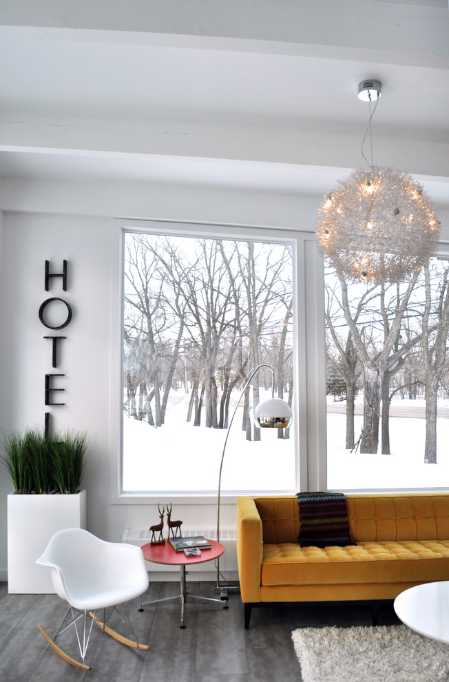
Plastic Light Fixture
Overly Bold Choices
While creativity and unique ideas are wonderful things to incorporate into your home, sometimes overly bold choices take things too far. This bathroom, for example, took the idea of mosaics a little too far, leading the room to become overwhelming and not pleasing to the eye.
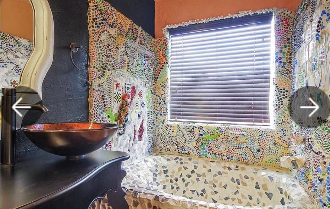
Overly Bold Choices
Much-Too Modern Choices
While keeping your home modern and up to date is never a bad thing to do, it’s also important to keep it all in proportion. Modern pieces are a great way to update your home, but make sure it doesn’t go too far, like this see-through toilet. We’re sure your guests will not appreciate the clear toilet bowl as well.
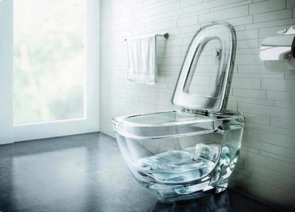
Much Too Modern Choices
Avant Guard Cabinets
Trying to have your cabinets look like padded cushions is definitely not a good idea. Cohesion in design is important, but that doesn’t mean that the living room furniture needs to become the kitchen furniture. Instead, keep these rooms separate but coordinated.
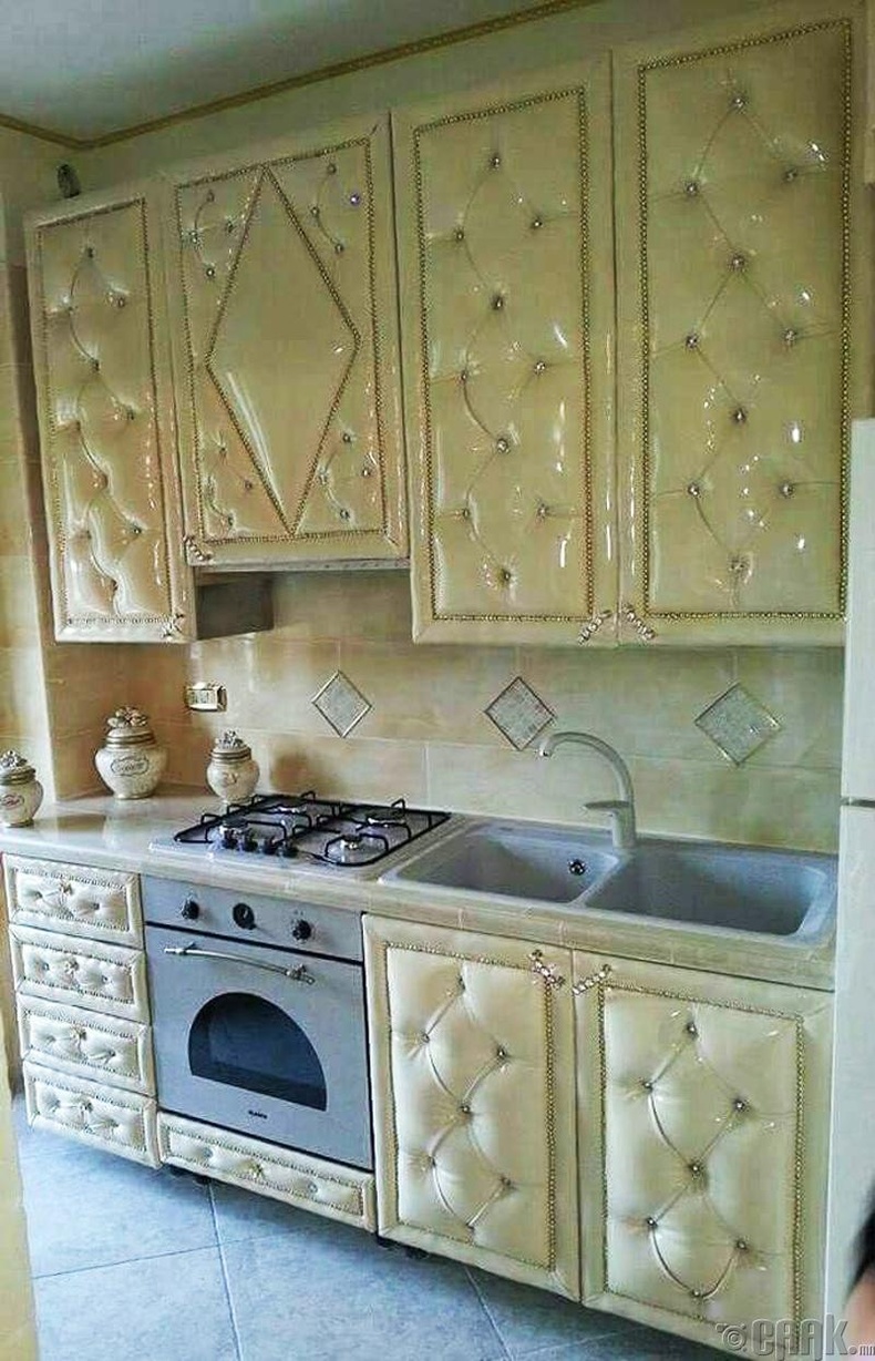
Avant Guard Cabinets
Bold Murals
Adding a mural to your home can add a unique touch. However, it’s important to make sure the mural adds rather than takes away from the room’s ambiance. This mural may actually intimidate your guests rather than make them feel welcome.
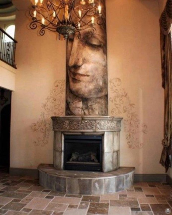
Bold Murals
Fabric All Over
Adding some fabric into your home can be a nice touch, just make sure not to overdo it. These furry stairs are definitely a poor design choice, and must be a nightmare to clean!
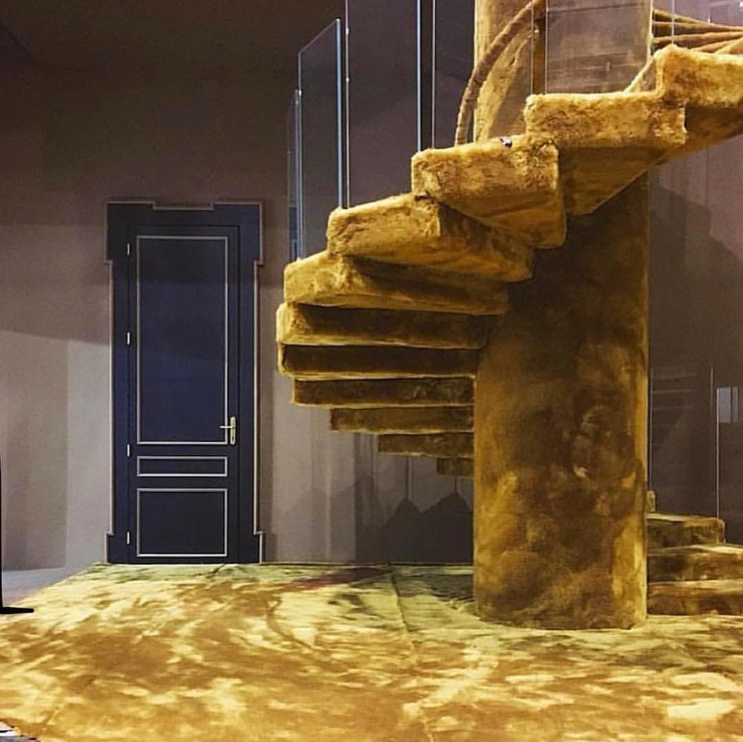
Fabric All Over
Too Many Framed Photos
Okay, we all love having photos of our loved ones around. They give us a sense of comfort and are a great memento to have. However, overloading too many framed photos will actually have the opposite effect. The overcrowding makes you lose focus overall.

Too Many Framed Photos
Unsightly Tangled Cords Mess
We know, every single gadget you own needs to be plugged in to be charged. However, that doesn’t mean that you need to have an overloaded mess of tangled chords in your living room. Instead, opt for organizing them and hiding them behind a piece of furniture.
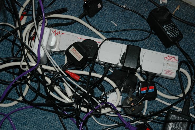
Unsightly Tangled Cords Mess
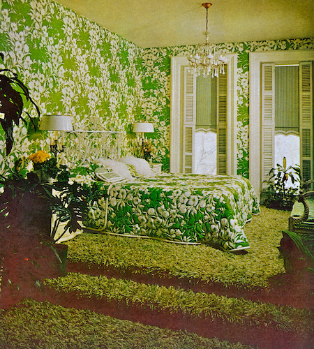
Focusing On One Color
While choosing a color theme is a step in the right direction, don’t take it to the next level by going overboard with one specific color. The finished look will look so overwhelming. Instead, choose on several colors that complement one another.
Focusing On One Color
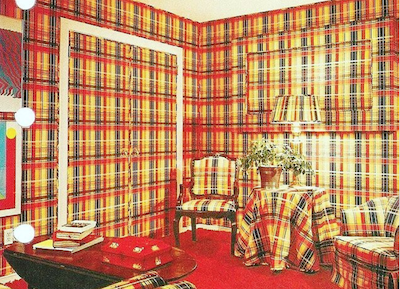
Too Much Matchy Matchy
Adding texture into a room can definitely add interest into your home, but make sure you’re not going overboard with it. While one textured piece can offset a neutral background, having everything match with the same loud texture will just become an eyesore.
Too Much Matchy Matchy
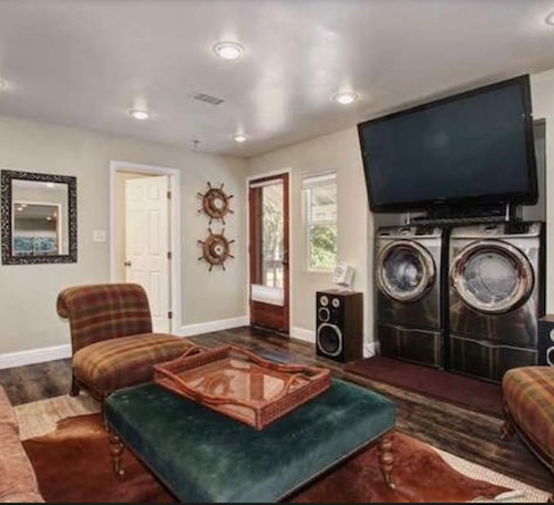
Overly Practical
While practical design is a great practice to incorporate into your living room decor, there is such thing as too practical. For example, installing your washer and dryer into the living room is probably taking it a step too far.
Overly Practical
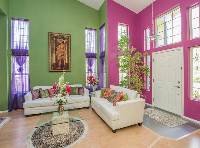
Not Choosing Color With Care
Adding a splash of color, even a bold choice, can add great depth to your living room. However, the best way to add a bold color in is to make sure the rest of the walls are painted a neutral color. Don’t overwhelm the room with too many bold color choices.
Not Choosing Color With Care
Too Much Taxidermy
In general, taxidermy should probably be a decor idea that’s left in the past. However, if you’re absolutely set on incorporating taxidermy in the room, don’t overdo it with too many pieces, especially all right next to each other.
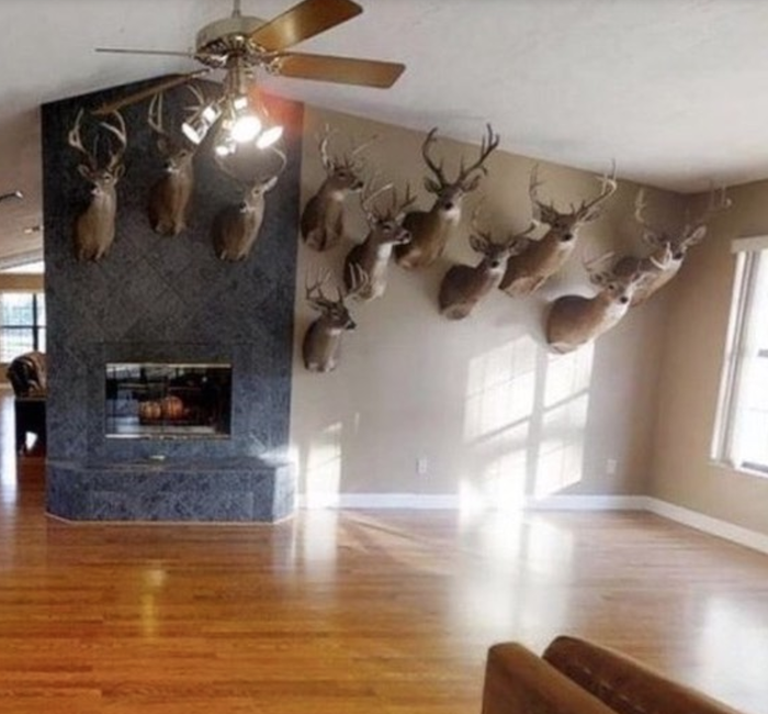
Too Much Taxidermy
Displaying An Eccentric Collection
Many of us have collections, whether it’s a stamp collection, coins, or dolls. While these collections can bring us lots of joy, it may not be the best idea to display them out in the open in the living room…especially if your collection is of dolls.
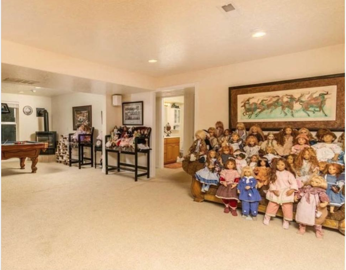
Displaying An Eccentric Collection
An Overly Eccentric Couch
While an out of the ordinary couch can be a fun addition to your living space, try to make sure that it is also functional. This giant kitty may be a cat-lover’s dream, but we’re sure that guests won’t love sitting on this giant feline.
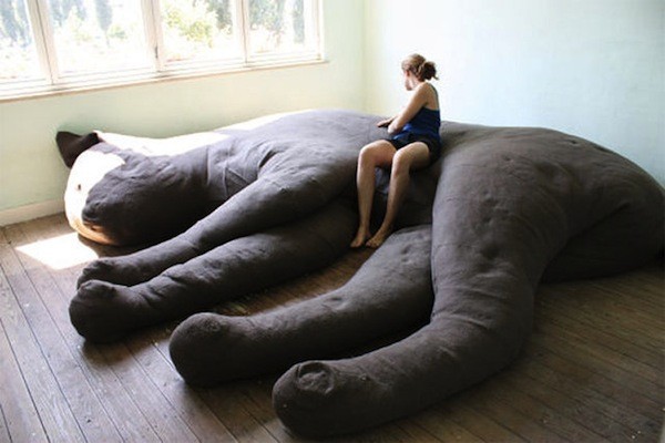
An Overly Eccentric Couch
Neon Lights Everywhere
Adding in some sparkle with fairy lights can add a nice festive touch to a room. However, too many of these artificial lights can quickly become overwhelming and lead to a very tacky feel for a room.
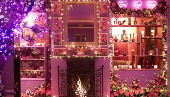
Neon Lights Everywhere
Overwhelming Texture And Color
Oh the textured wallpaper…while it can truly add a unique flair to a room, it’s so easy for it to take over the room. In order to nicely offset a bold wallpaper, make sure the rest of the room doesn’t match perfectly and instead offers a neutral background that blends in.
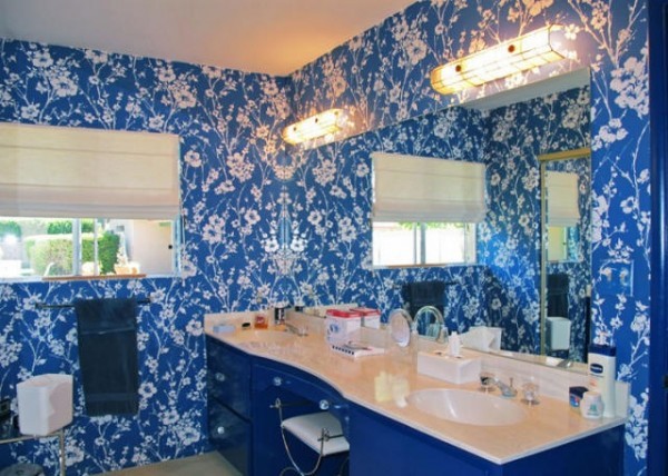
Overwhelming Texture And Color
Overly Busy Carpet
Adding a carpet to a home can add personality and texture to a room. Just make sure you don’t choose a carpet that will quickly overwhelm the room. The best is to stick to a neutral color that matches with many other aspects of the room and won’t demand too much focus.
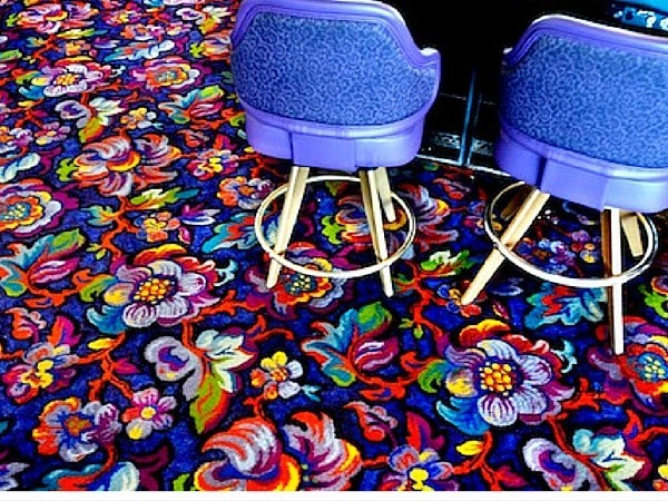
Overly Busy Carpet
Non-Functional Stairs
While funky stairs can be a fun addition to your home, make sure they’re not overly funky. At the end of the day, you want your stairs to be functional rather than an art installation.
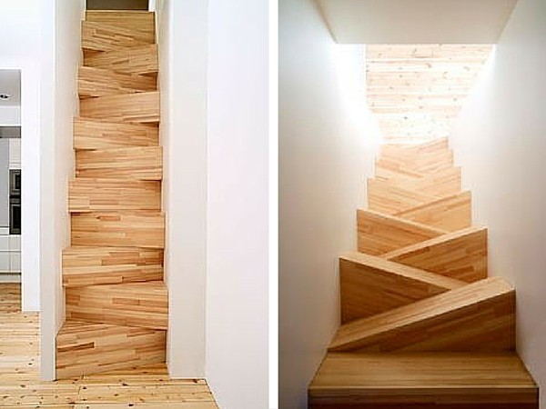
Non Functional Stairs
Tie-Dye Fail
While we understand that a lot of people love the look of tie-dye, we think it’s best to keep it to T-shirts. This especially applies to trying to spray paint a tie-dye design in your home. Maybe it’s best to just keep the plain white color that came with the place instead.
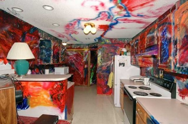
Tie Dye Fail
A Wild Exterior
While keeping a nice interior design in your home, it’s equally important to make sure your home’s exterior is also pleasing to the eye. Therefore, it’s probably best to avoid a busy or crazy pattern for your home. You don’t want your neighbors to refer to your house as that crazy house.
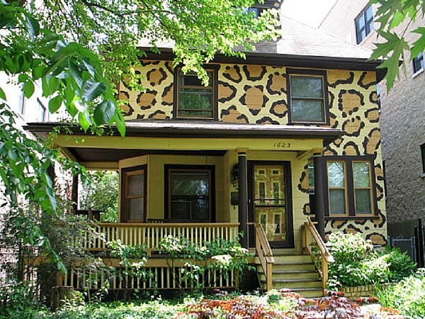
A Wild Exterior


